THE BLOG
This blog serves as an informal opportunity for me to share anything and everything that I find interesting in the world of design - from talks I've enjoyed and exhibitions I've visited to works that inspire me and creatives that I admire.
Hopefully you can find some inspiration, and if there's anything you'd like to share with me, feel free to email me!
DOMUS // 01/12/22 // #131
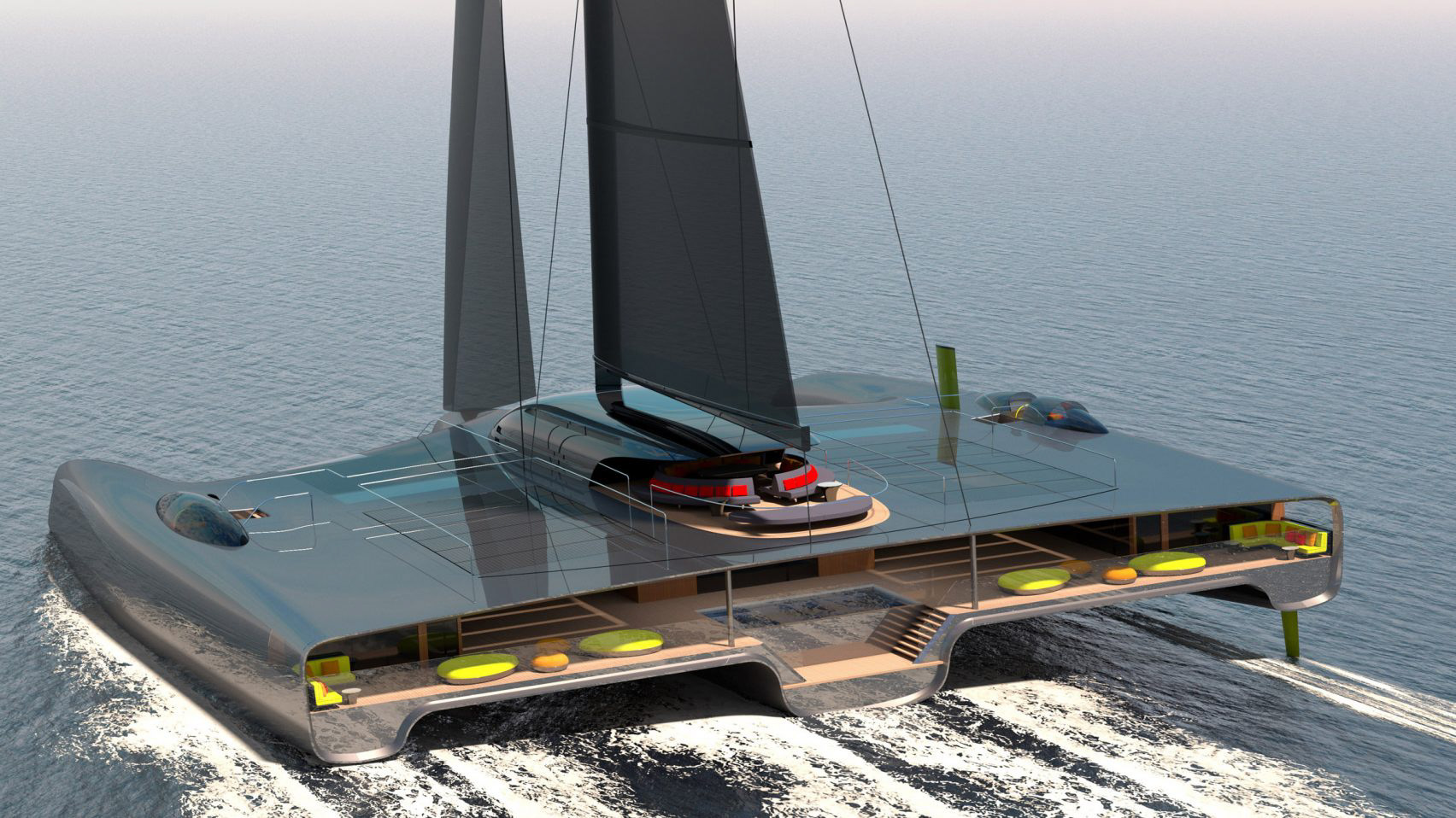
The Domus trimaran, designed by yacht studios Van Geest Design and Rob Doyle Design, aims to be the "worlds first truly zero-emission yacht over 750 gross tonnage". I came across this concept at a time where I myself have been working on a project that encourages sustainable transportation and adventure, and I found a lot of parallels into this project. The yacht uses a variety of technology to give it a theoretically unlimited range, making it a seriously strong choice for a survival vehicle in the event of a zombie apocalypse.
On a more serious note, this did get me thinking about how designers should be excited about what the product can enable the users to achieve, rather than being over-consumed by the endless small design decisions that may never make an impact on the people that interact with it. Truly great designs won't just be better products for a human to interact with, but they will actually make the human themselves better; designs like this could enable people to push their own boundaries, explore new locations, make important discoveries, and enrich their souls.
ICONS // 25/09/22 // #130
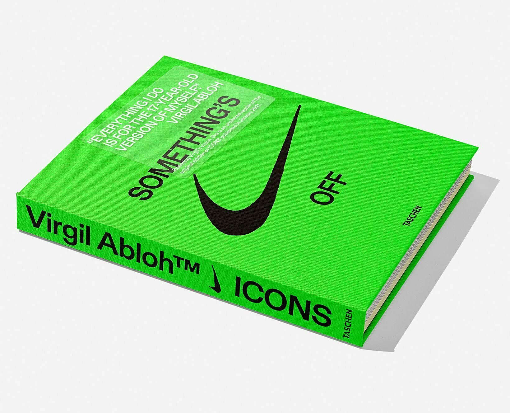
I received this book for my birthday, not long after Virgil Abloh passed away, and while I've flicked through sporadically since then, today was the first time I have properly sat down with the book to begin reading it cover to cover. The book focuses on 'The Ten', a collaboration between Virgil and Nike where he reinvented 10 of their most iconic shoes.
The book offers a beautiful insight into Abloh's thinking and creative process, sharing everything from archival examples he used as inspiration, unseen photos of prototypes, and texts between him and the team - allowing me to feel like a fly on the wall as they discuss potential ideas for their next creation. This insight, alongside a beautifully written introduction, has left me eager to continue working my way through the book next week. If you get the chance, I'd thoroughly recommend reading it.
OKI SATO // 14/09/22 // #129
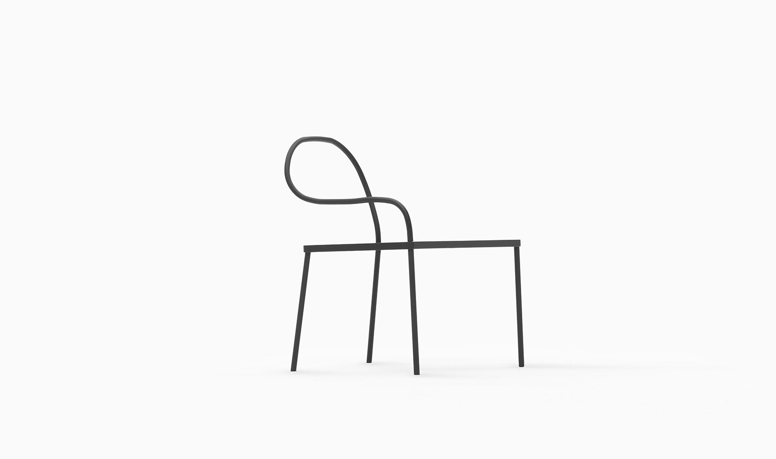
I came across a LinkedIn post this week asking people to share their favourite designers, and one that caught my eye was Oki Sato - a Japanese designer and the founder of Nendo. This object in particular, the Melt chair designed by Nendo for K%, immediately captivated me.
The single, continuous line that acts as a backrest and two of the legs gives it a clean and minimal aesthetic, while the harsh black metal gives it a somewhat brutalist feel. In this photo in particular, the deep black chair standing out from the plain white background makes it feel like a sketch on a page, and my brain drew immediate comparisons to Joshua Vides' work - both for the colour palette and the 3D sketch idea. I've got no clue how comfortable it would be to sit on this rather unembellished chair, but I'd love to have one in my home for the looks alone!
AIRLIFT // 08/09/22 // #128
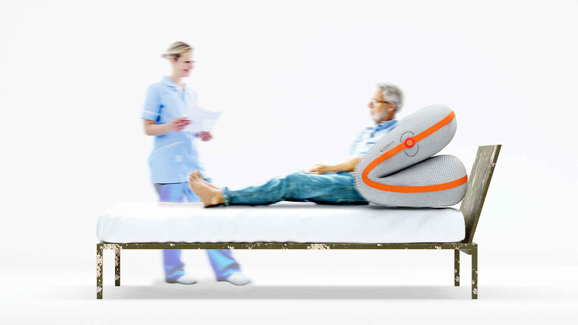
The James Dyson Award winners were announced today and the national winner for Australia caught my eye. The Airlift is a “low cost, pneumatic patient transfer device which helps unaccompanied Healthcare Workers safely perform three key patient movements”. It is essentially an airbag that a patient lies on that can be inflated in different ways to safely manoeuvre their bodies - assisting with sitting up, rolling over, or being repositioned in bed. I loved their idea of ‘letting the air do the heavy lifting’, and projects that have a clear problem and clever solution are always favourites of mine.
The project video highlights some key statistics that Airlift is addressing, with some stunning visuals to showcase the product in action. Check out the project at https://www.jamesdysonaward.org/2022/project/airlift/
HAVE A LITTLE NEBL // 11/08/22 // #127
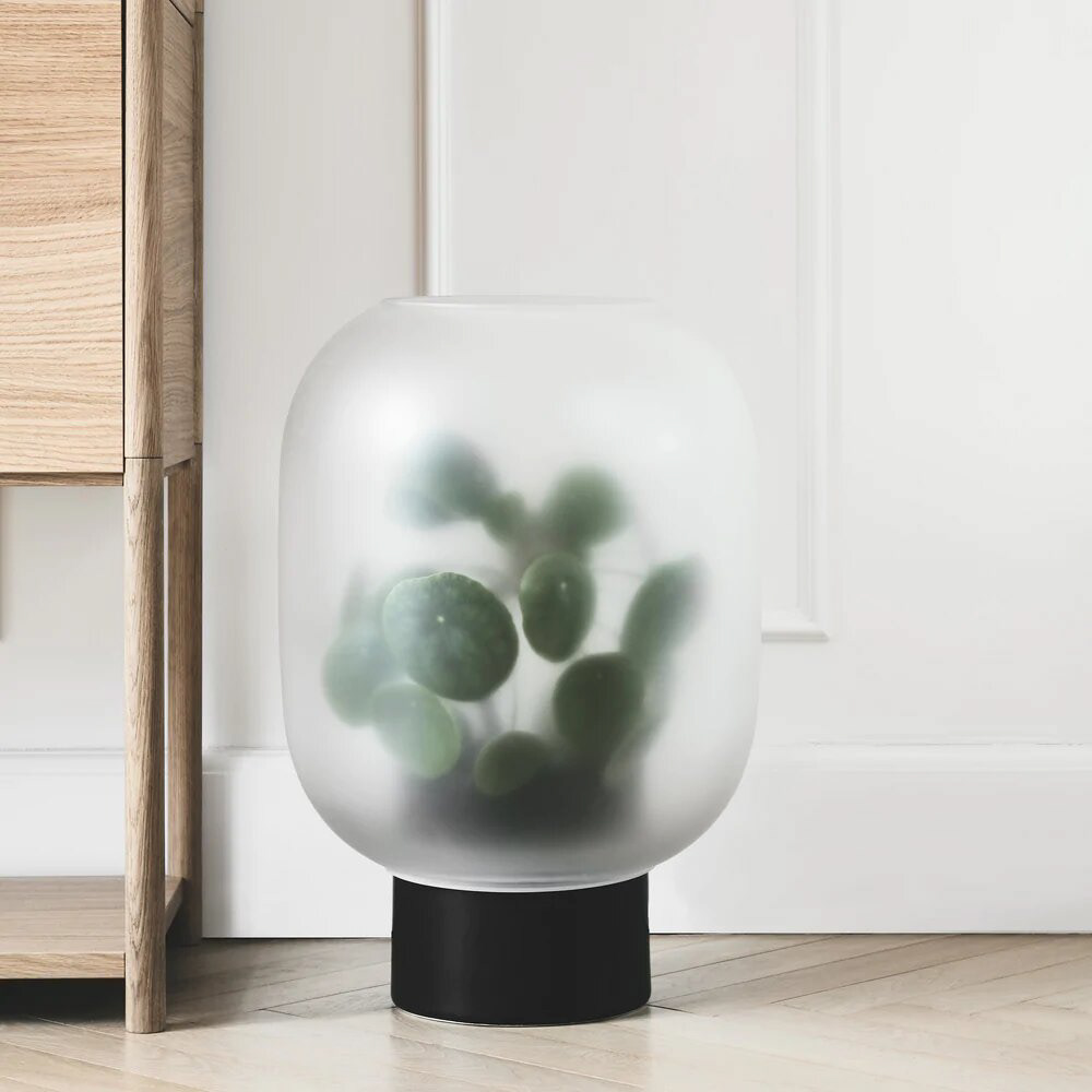
I discovered this cool little plant pot online recently and thought I’d share. There’s not a whole lot to it, but I really like how the minimalist piece add’s a bit of mystery and intrigue to the plant; it is reminiscent of tense scenes in sci-if films where the alien is just about to jump out of the fog. The Michael Rem designed product features a ceramic base and frosted glass cover, and I think the simplicity of the two premium materials works wonders.
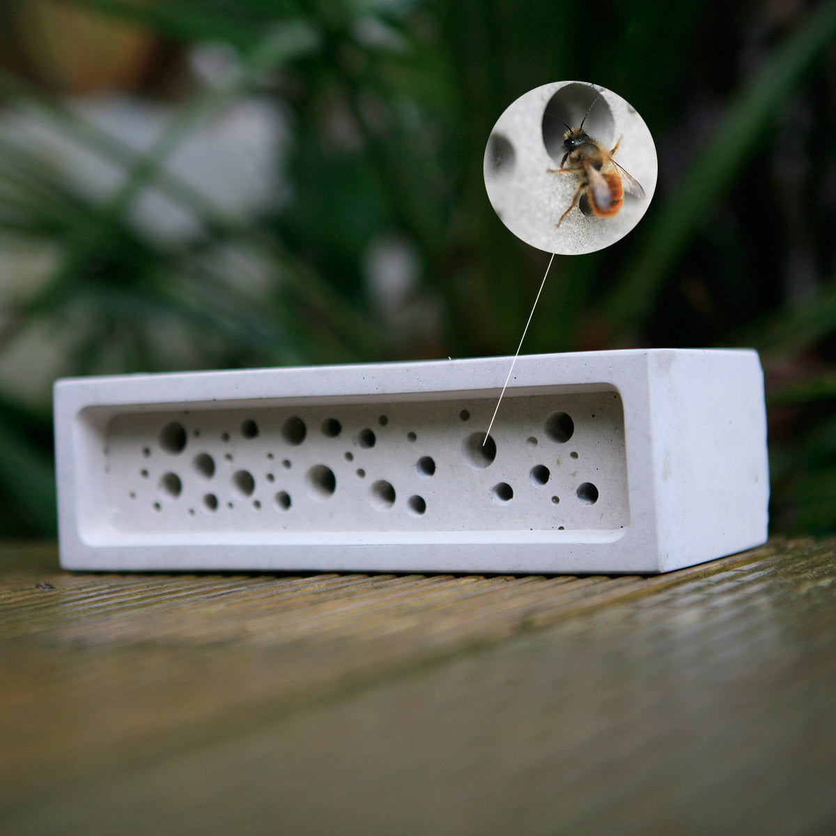
BEE BRICK // 28/07/22 // #126
I came across a story on Twitter a while back that I decided to revisit today. The story covered how Brighton and Hove’s council had made it mandatory for new buildings to feature bee bricks - a special brick with holes that offer bees a nesting site in built-up areas. Bee brick was created by Kate Christman during a research project at Falmouth University and it is now being sold to be used in new building projects.
I love how this project highlights how design can have a positive impact on surrounding environments, and it is particularly interesting to see councils and governments put design into policy/law. The brutalist aesthetic reminds me of concrete projects I did myself at university, and the scattered cylinder cutouts for bees add an interesting aesthetic to the brick. In the interest of giving the full picture, it is worth noting that the project has its critics; with the main comments surrounding the risk of the bricks attracting mites and spreading disease, and some believe it the holes are not big enough to adequately benefit bees. It has also been stated that developers could use the brick for greenwashing their projects, and if this happens I hope the public sees through the facade of fake eco-friendliness.
Overall, I really like the design of the brick and I hope that it can make a positive impact in residential areas, but biology Professor Dave Goulson makes a strong point in highlighting the need for wider, more impactful changes to impact biodiversity. He also highlights the risk of this brick being used by developers to greenwash their projects.
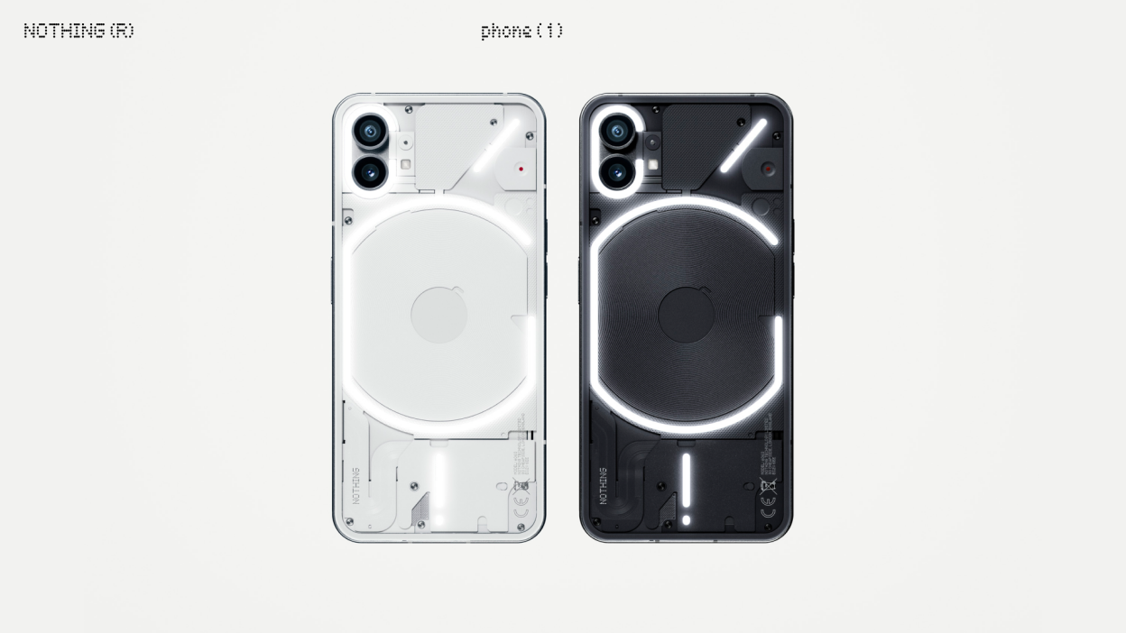
NOTHING // 21/07/22 // #125
As both a designer and a tech enthusiast, I'm always trying to stay informed about the latest products being announced and released. I've followed Carl Pei (the man behind Oneplus and now Nothing) for a while now, so when it was announced that he had launched a new company that was aiming to challenge the status-quo with an exciting new design language, I was immediately intrigued.
Nothing's first phone has left me torn in many ways, from both a designer's perspective and a consumer's perspective. For context, the industrial design is the unique selling point of this phone; the clear back showcases the cleverly displayed internal components - all colour-matched to keep a uniform look, of course - and the accent LED's scattered around the back offer some unique gimmicks. From a designer's perspective, I should be very pleased that a company is putting such a heavy focus on industrial design, and I commend them for tying something unique with the aesthetics. Putting such weight on the industrial design is an acknowledgement of the importance of design, but I can't help but feel like they've come up short. This is where the consumer perspective comes into play. While the design is cool, how long are you actually going to be looking at the back of the phone? For most people, after the initial week of admiring your new toy and showing it to a few friends, the novelty value will wear off and you will be left with a phone that looks cool on the back, but is distinctly average when interacting on the front.
I do hope Nothing can continue to release new products with their unique styling, but I truly believe a good product has to have more to it than just being pretty. A good design needs to consider why someone would be using this phone, what else could add value to their experience, and how the entire user experience could be improved - not just adding some cool pieces on the back. I am so happy that industrial design is being showcased as such an important feature - especially in an age where digital design seems to get all the focus in the media and job market; hopefully this benefits all industrial designers and leads to other companies focusing more on the physical design of their products, but there needs to be more value in the product than just it's aesthetics, especially a market as competitive as the phone market.
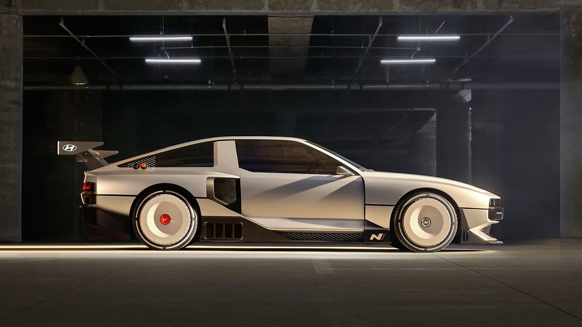
N VISION THE FUTURE // 18/07/22 // #124
The big design story I have been seeing this week is Hyundai's N Vision 74, named after it's 1974-inspired styling. Underneath the beautiful retro-racing style body panels is a statement of future intent from the car company, race-focused hydrogen fuel cell technology. But despite the impressive tech, it's what's on the surface that has everybody talking...
The simple, angled aluminium-looking body panels remind me of the Tesla cyber truck, but the sharp angles and aggressive wing immediately makes me think of the Group B rally era. They've done an amazing job with the wheels, making what is the nicest looking aero-focused wheel hub I've ever seen. Subtle graphic touches with the lines at the back of the window hint towards what a full racing livery could be, but leave that very much to the imagination. Unfortunately, this concept will likely never be made for real customers, but it is a great showcase of what the future could be, and a fun reminiscence of a bygone motorsport era.
CONSISTENCY IS KEY // 11/07/22 // #123
Consistency is key, and I have definitely not been consistent with this blog. In fact, it’s been over a year since my last post. I’ll put this down to being busy (or lazy over summer), but as I truly do believe consistency is key, I’m going to start posting regularly again. I’ll hold myself to the target of at least one post a week, this seems far more achievable than trying to do it every single day and inevitably getting fed up with it all. One post a week, something at least a little bit design related, maybe some more in depth analysis than my previous posts - and I’ll brand this all as season 3 of my blog. Here we go…