A B E R L O U R X R E A L I T Y T O I D E A
T H E B R I E F
The brief for this project was to select a whisky brand under the Chivas Brothers umbrella and identify another suitable brand to produce a limited edition collaboration run. The collaboration had to produce a bottle (although no alterations to the shape of the bottle were permitted), packaging, and a companion product. The brief highlighted a particular focus on sustainability as brands are under increasing pressure from consumers to show that they are environmentally conscious.
T H E I D E A
After analysing the various whisky brands in Chivas Brothers' portfolio as well as countless potential collaborators, Aberlour and Reality To Idea stood out as the perfect pairing. The two brands had an overlap in target audience, price point, and most importantly, values. I set out to blend the signature aesthetic of Reality To Idea with the existing branding of Aberlour, with a particular focus on the handmade craftsmanship of both brands.
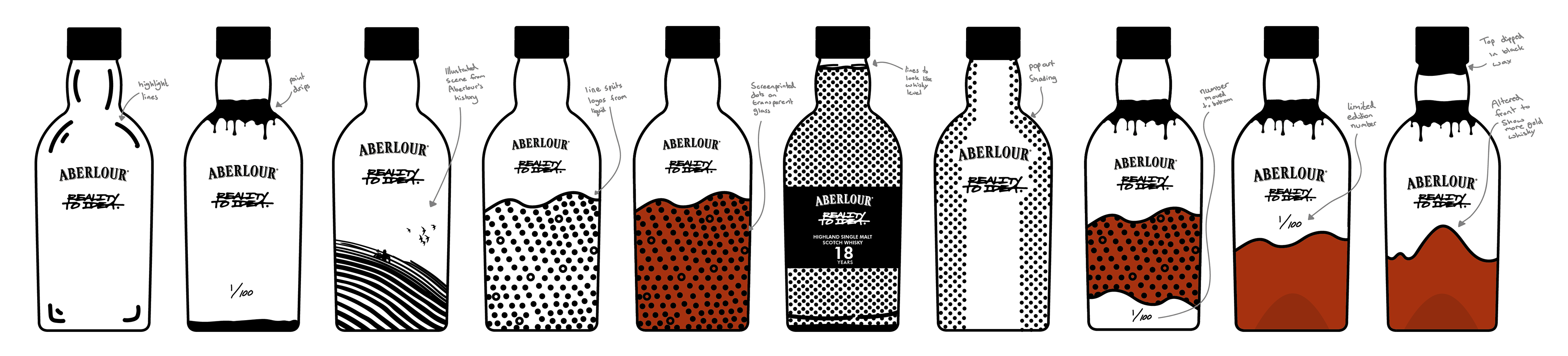
T H E B O T T L E D E V E L O P M E N T
As the collaboration was with an artist, I knew the design of the bottle had to stand out from other whisky bottles on the market and become an art piece in itself. I explored many different styles of bottle design in 2D to begin, with a variety of concepts and complexity throughout. I tested some illustrative designs as well as a more traditional label design, but I was drawn towards a painted design that left some of the bottle contents visible to truly showcase the quality and values of both brands.
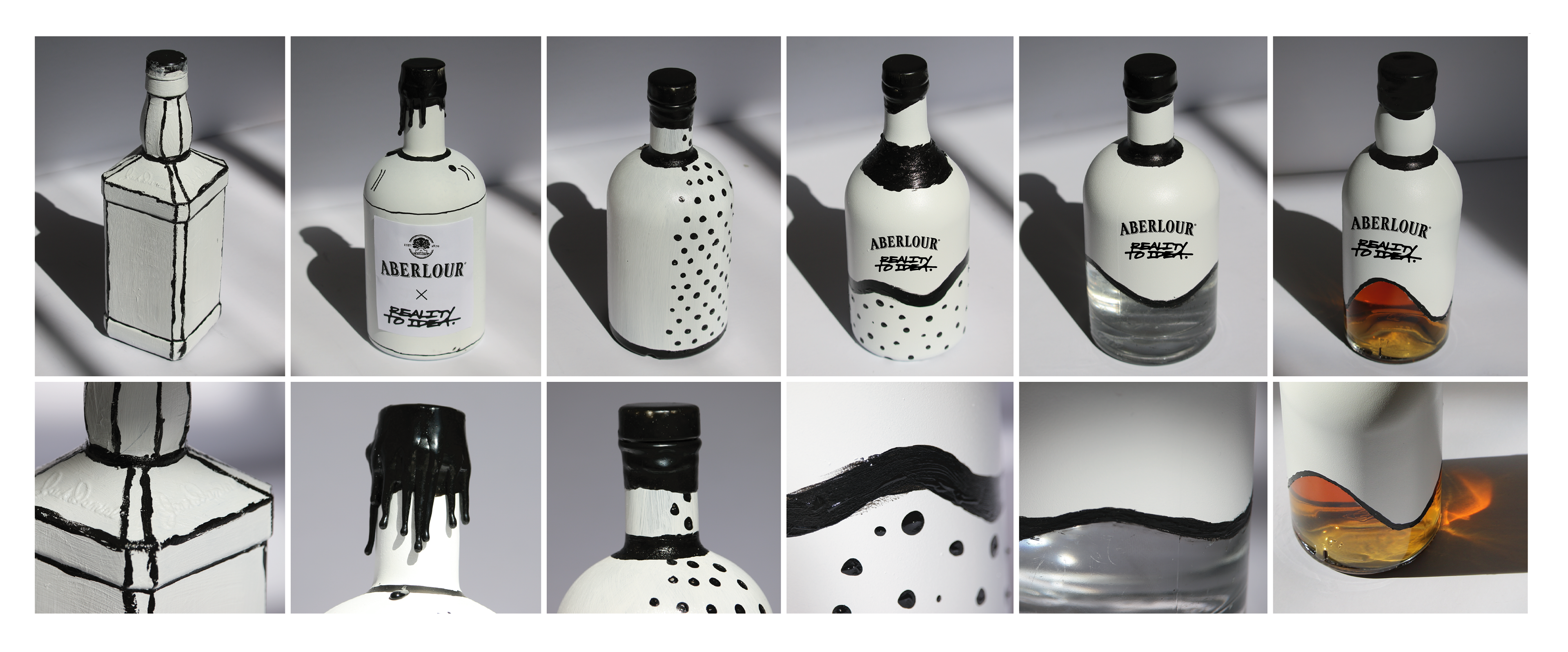
T H E B O T T L E P R O T O T Y P E S
I used physical bottles to prototype my favourite 2D concepts as I knew some ideas wouldn’t translate well to reality. The prototypes let me explore different wax seal applications and I tested different paint applications until I was pleased with the end result. The final prototype, an aged bottle of Aberlour, created such a pleasant glow in the sun that it convinced me to leave some of the bottle unpainted in the final design to fully show of the quality of the product.
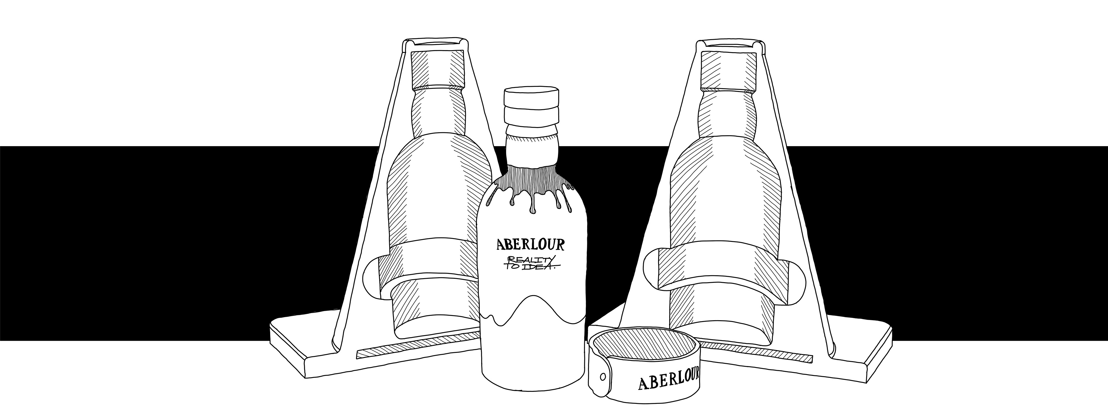
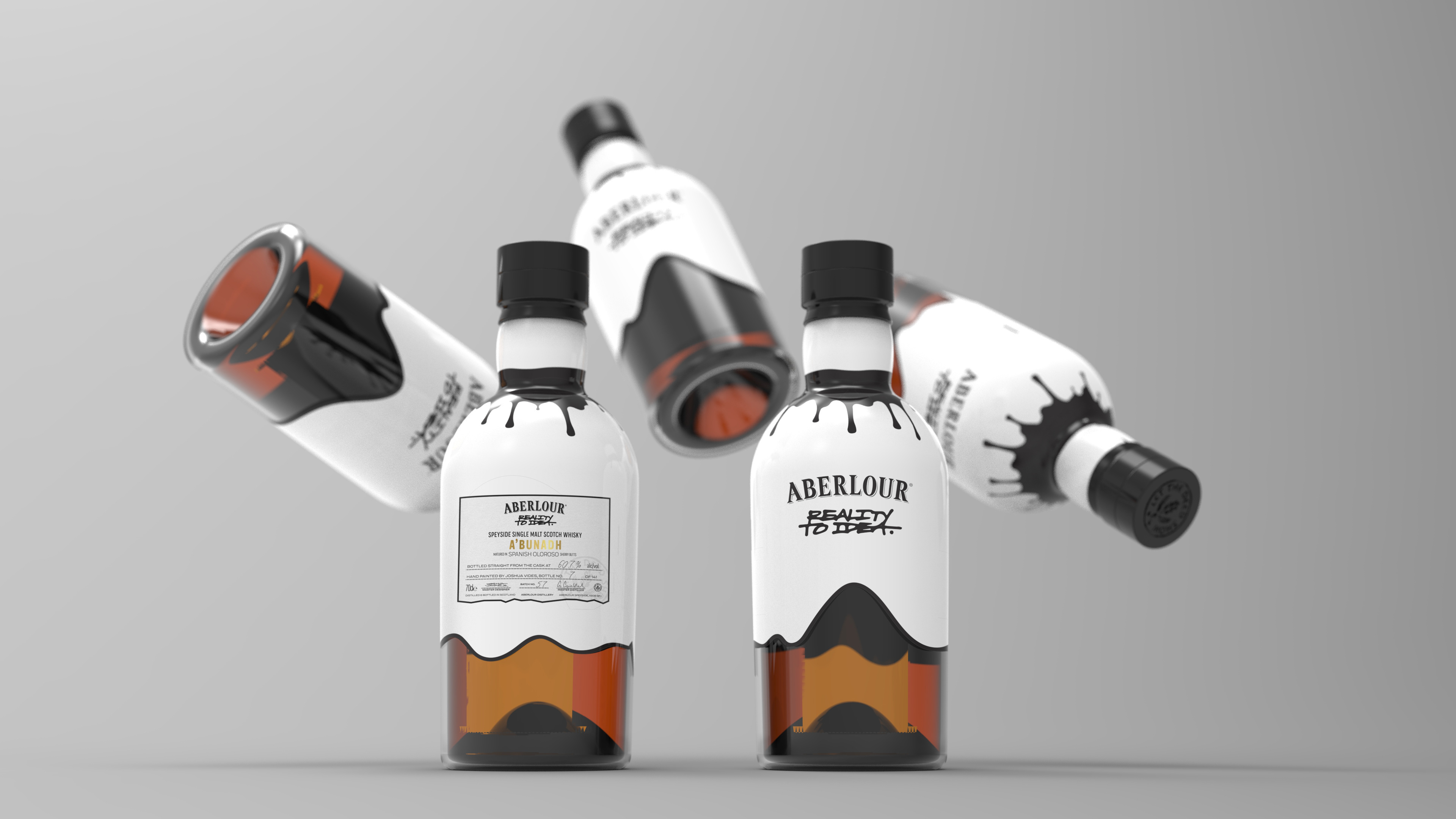
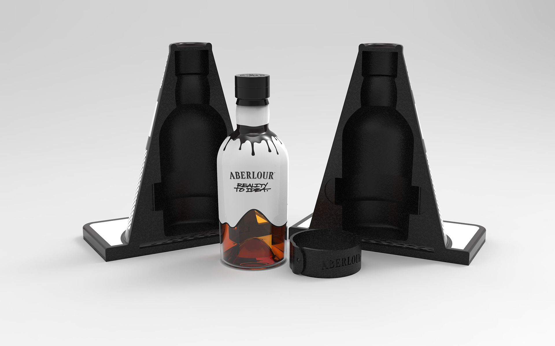
T H E F I N A L B O T T L E
The final bottle design features a hand painted design with the base left unpainted. It comes with a stamped wax seal on the neck of the bottle and a dripped paint effect that spills onto the main space of the bottle. The label on the back features the limited edition bottle number as well as the signature of the painter and whisky distiller to add collectors value to the product.

T H E P A C K A G I N G D E V E L O P M E N T
The packaging was a huge focus of the collection; It would be the first thing the consumer interacts with and it had to set the bar high for the full unboxing and drinking experience. I took the traffic cone, one of Reality To Idea’s most notable pieces, and used it as both a casing for the contents as well as a set of bookends for when the contents are removed.
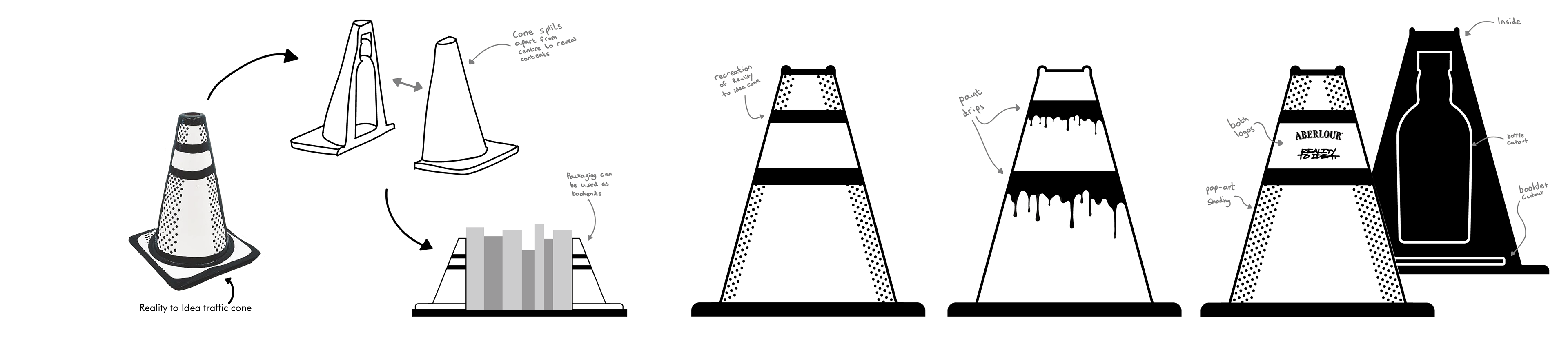
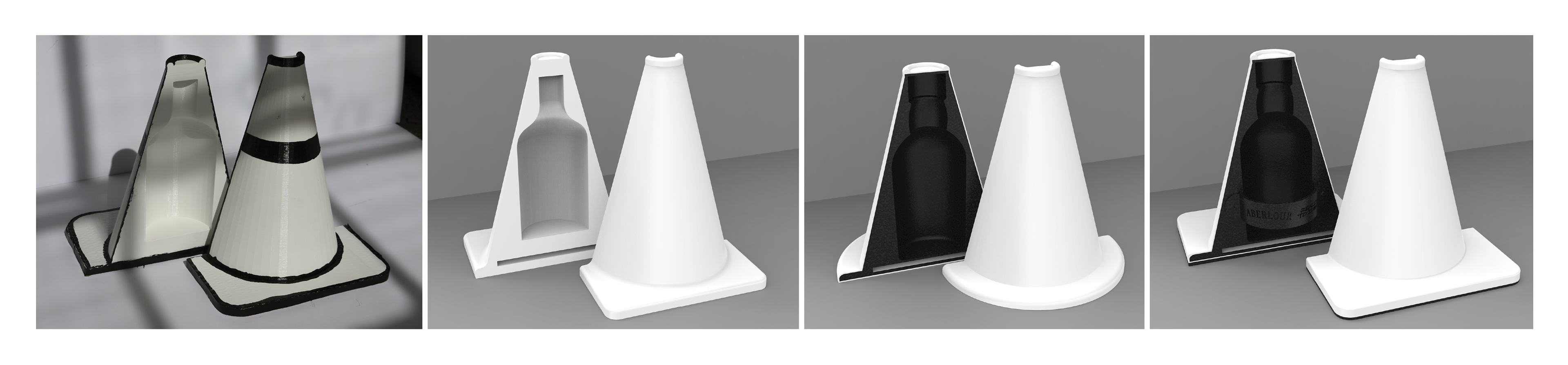
T H E P A C K A G I N G P R O T O T Y P E S
I used 3D printing, cardboard and paint to create a physical prototype of the packaging that allowed me to check it would be able to house the contents without being too large for shelving. I used digital prototypes to further prototype options, allowing me to add details such as a soft lining (made from waste pineapple leaf fibre that replicates leather), magnet placements, a strap, and exact bottle cutouts.
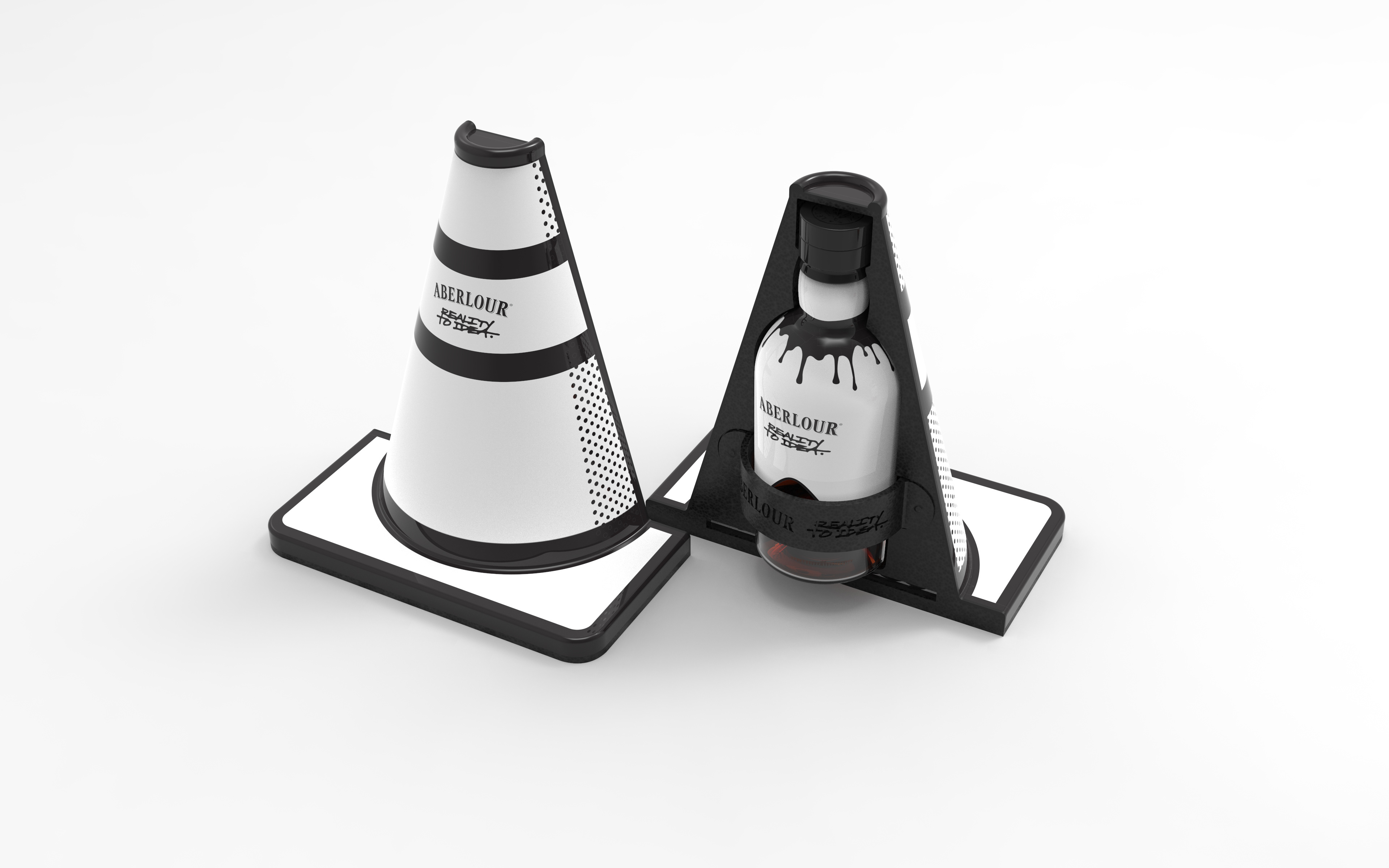
T H E F I N A L P A C K A G I N G
The packaging is a signature Reality To Idea style traffic cone made from sustainable compacted brewery waste, ensuring the packaging is environmentally friendly whilst having a strong, weighted feel in the hand. The inner lining protects the bottle, while further adding to the luxury experience. The packaging can be kept whole and showcased as a collectible art piece, or it can be separated into multiple other products.

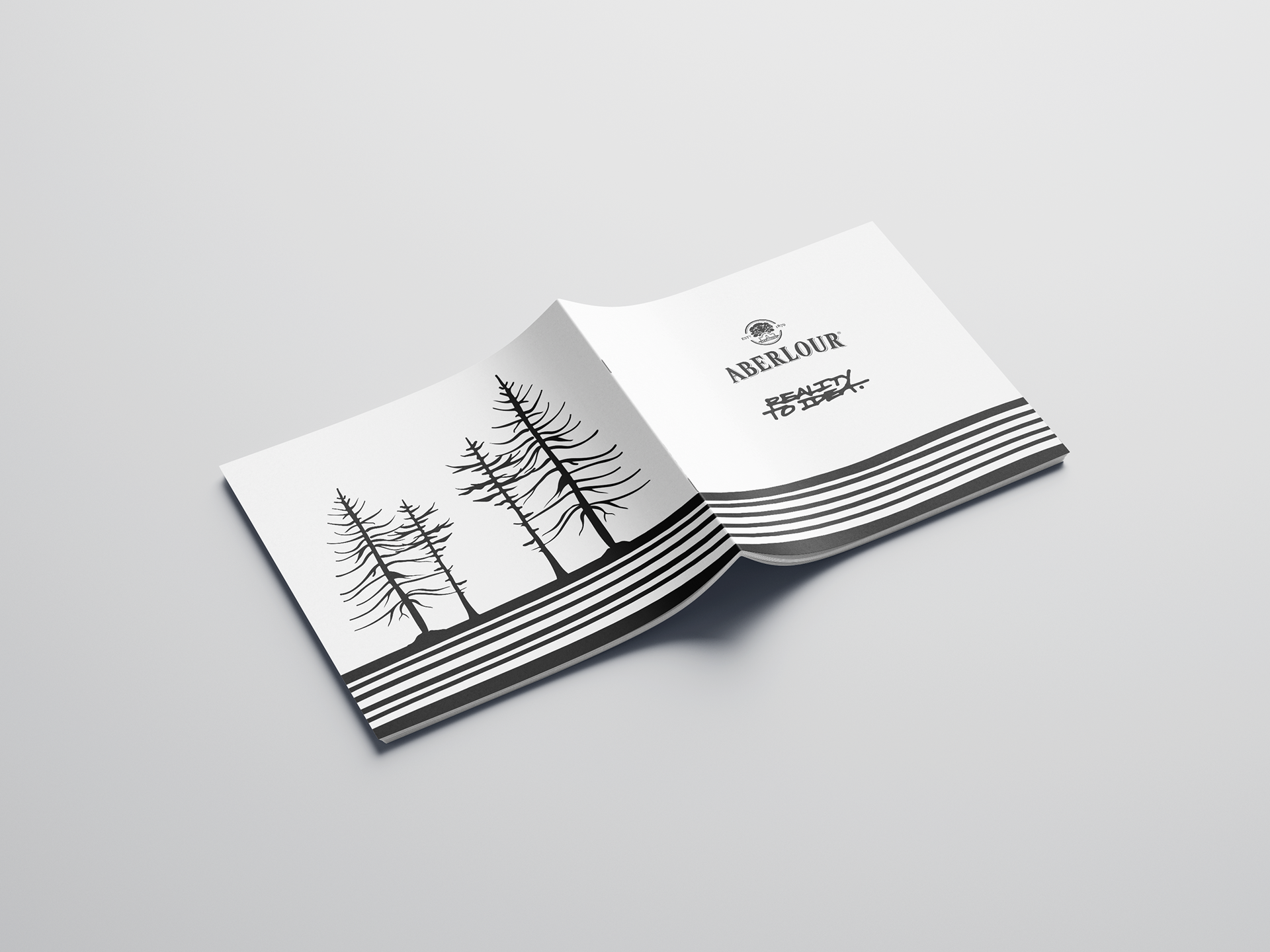
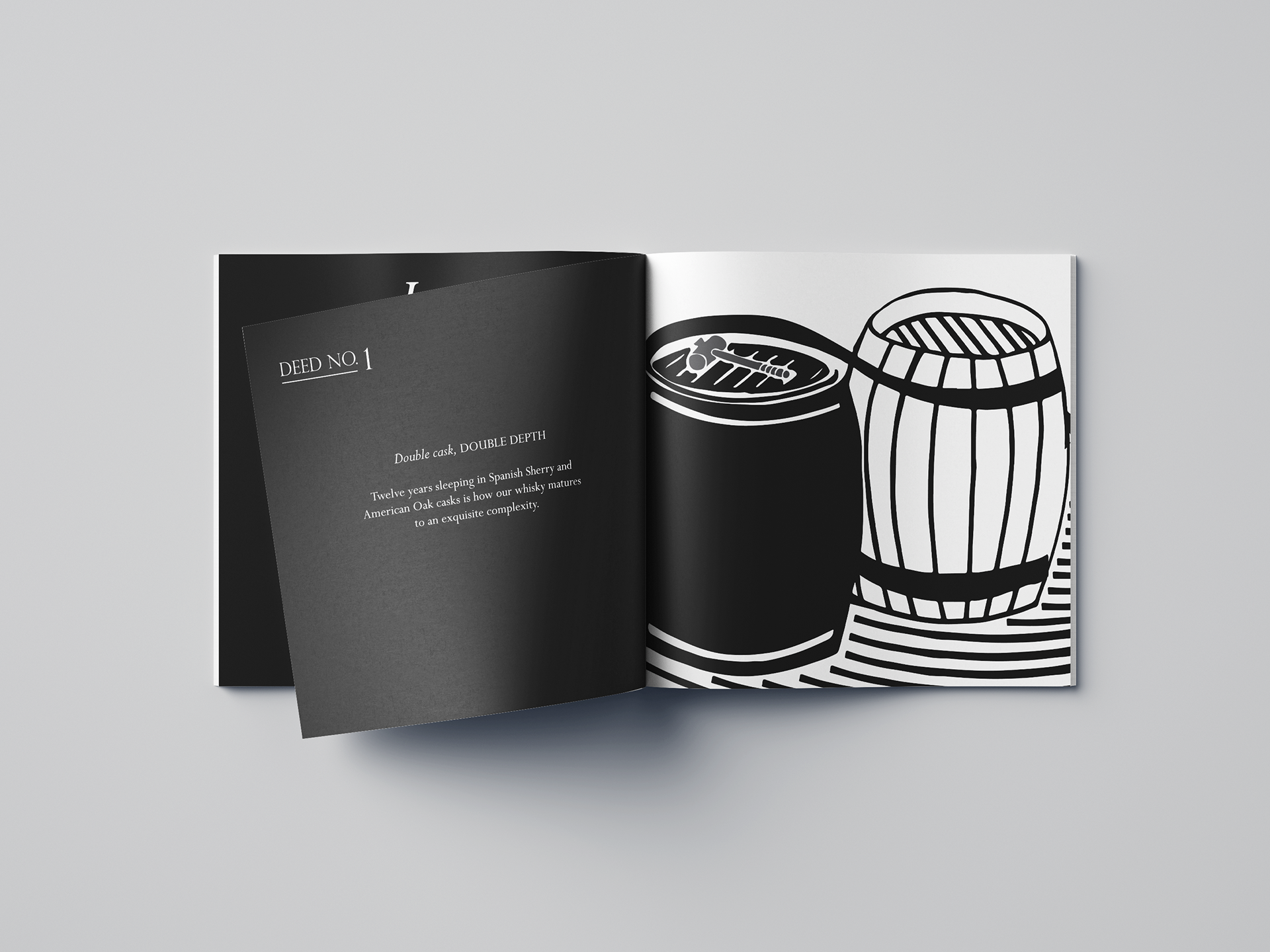
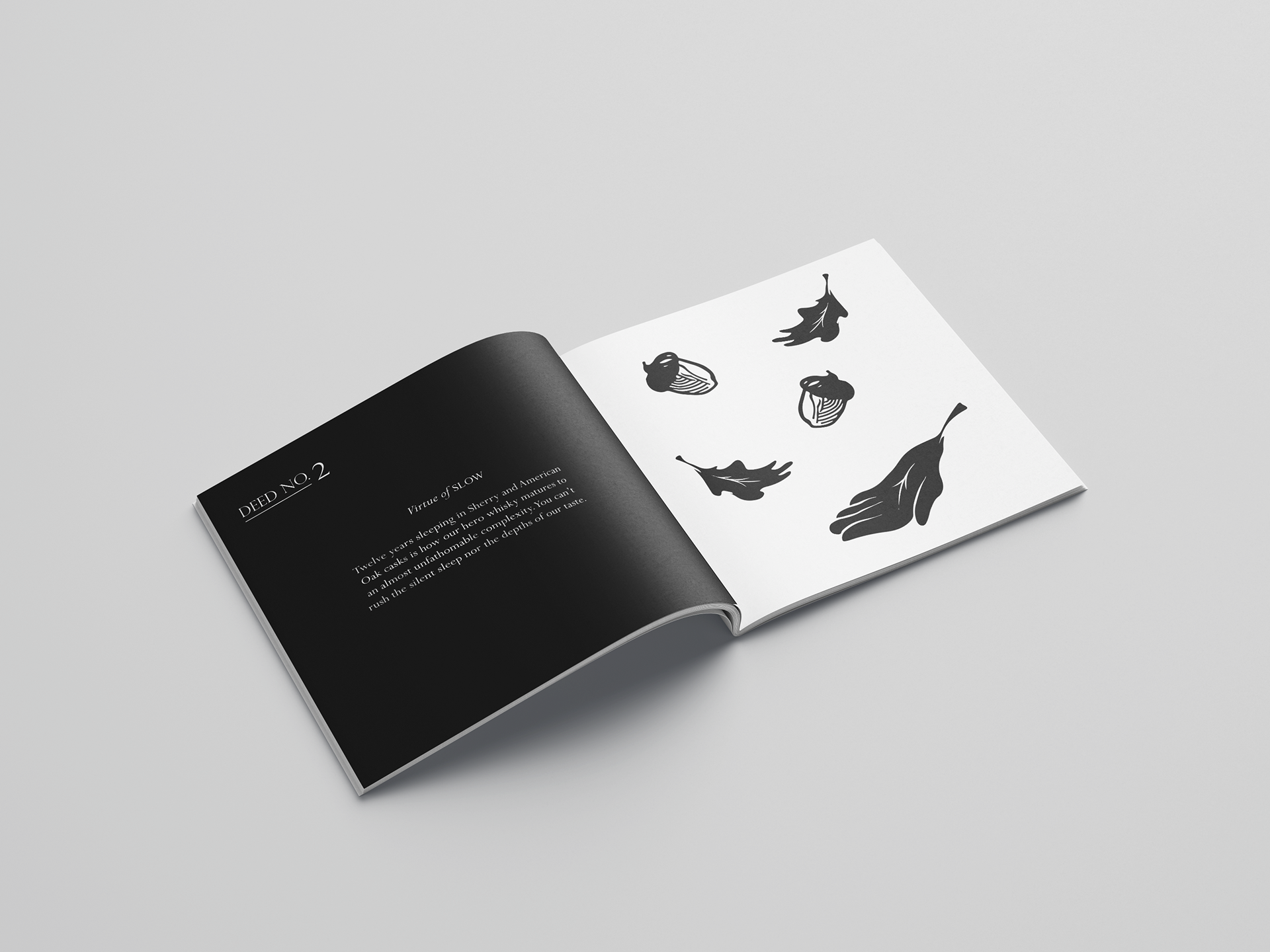
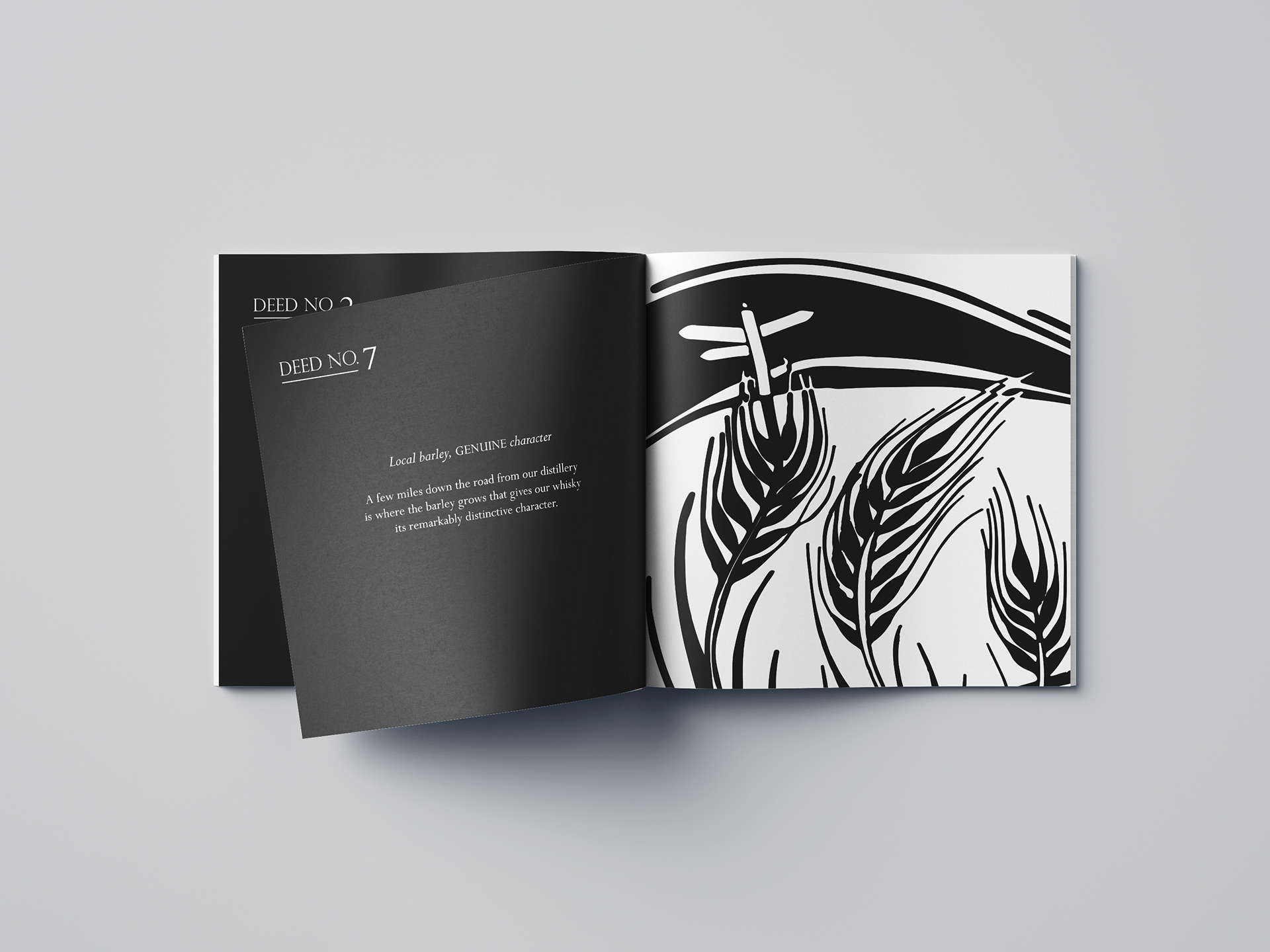
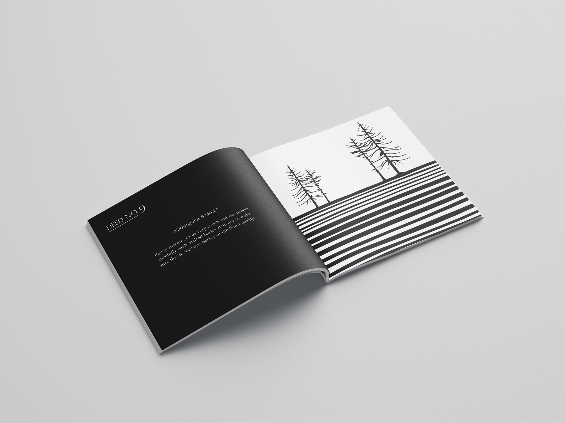
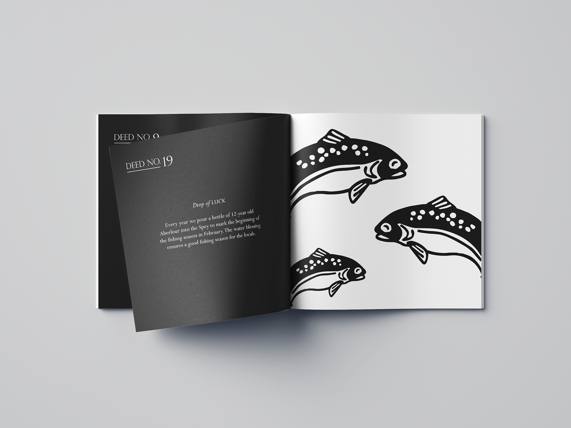
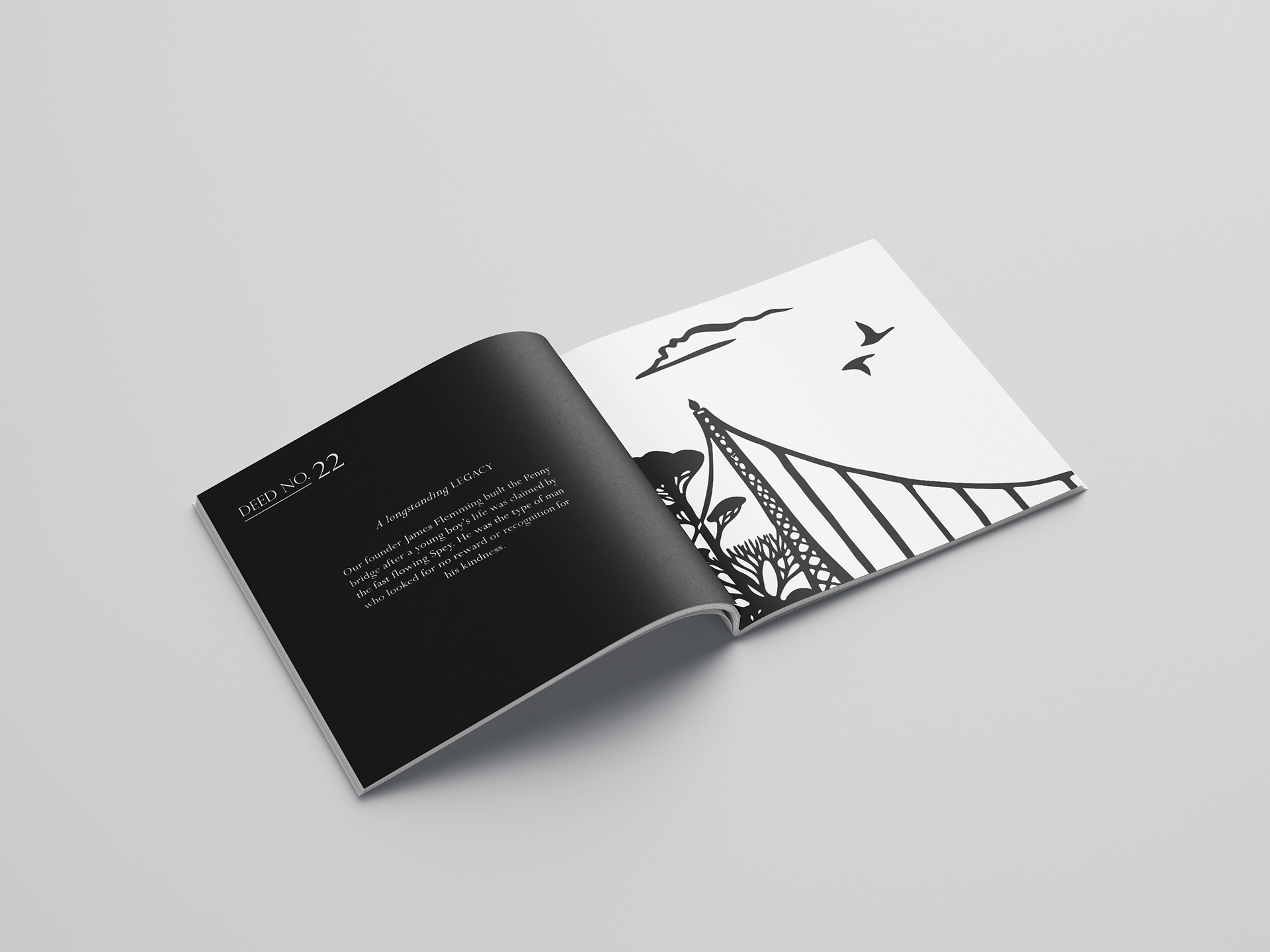
T H E B O O K L E T
Housed inside the base of the packaging is a booklet explaining the collaboration between the two brands, going into particular detail on the Aberlour ‘deeds’, which is essentially their brand values. The booklet is printed on high quality paper and features a blend of Aberlour illustrations with the black and white Reality To Idea aesthetic.


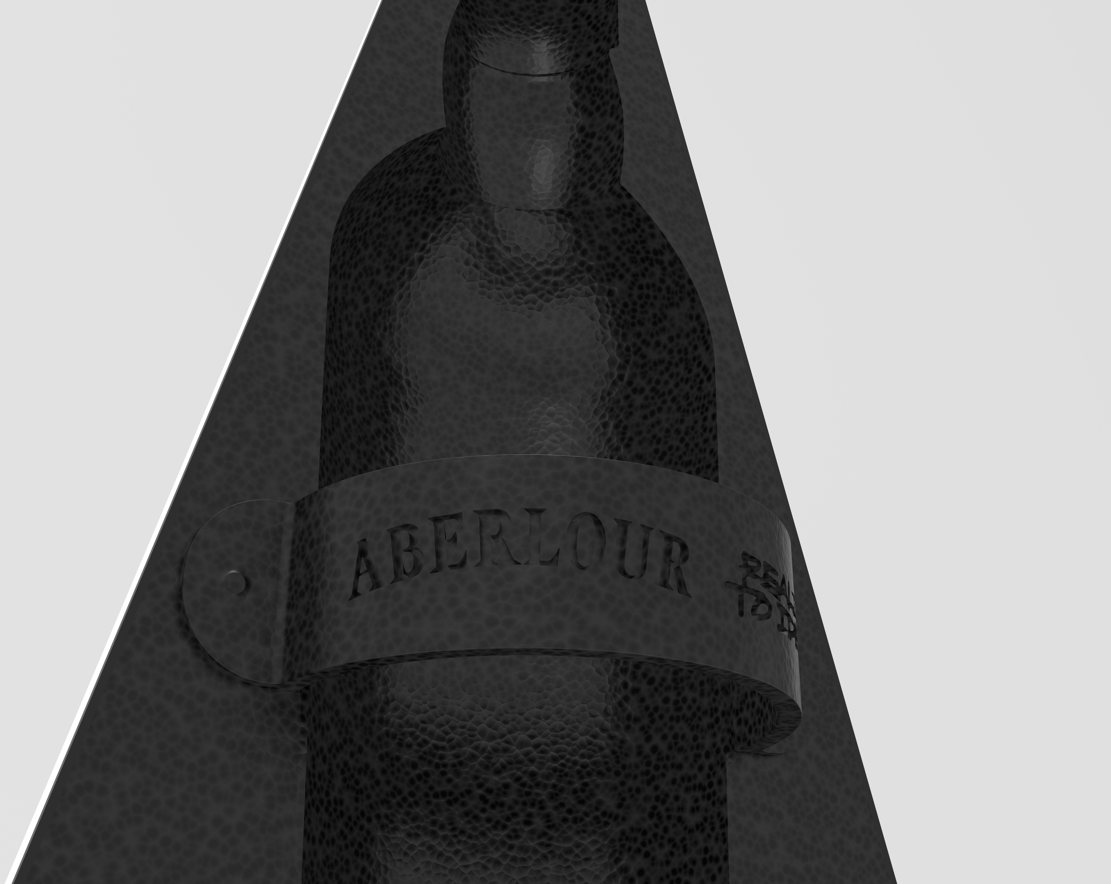
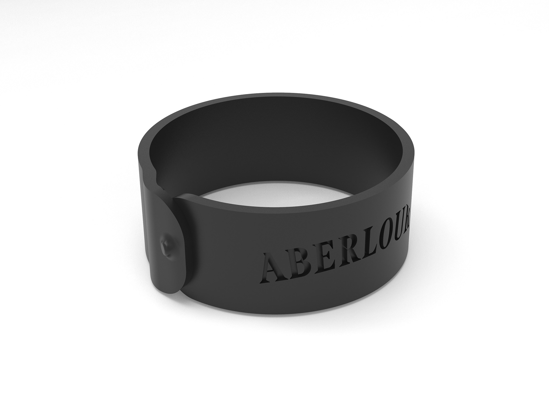
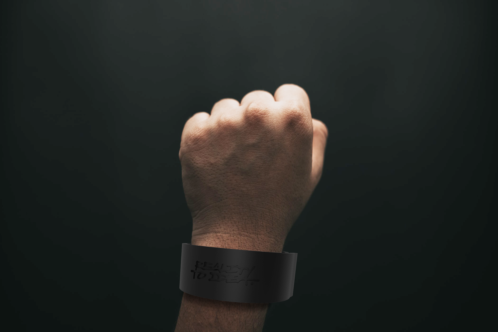
T H E B R A C E L E T
The strap that holds the bottle in place in the packaging can be removed and worn as a bracelet. While not to everyone’s taste, it further enforces the focus on reusability and sustainability throughout the collaboration.
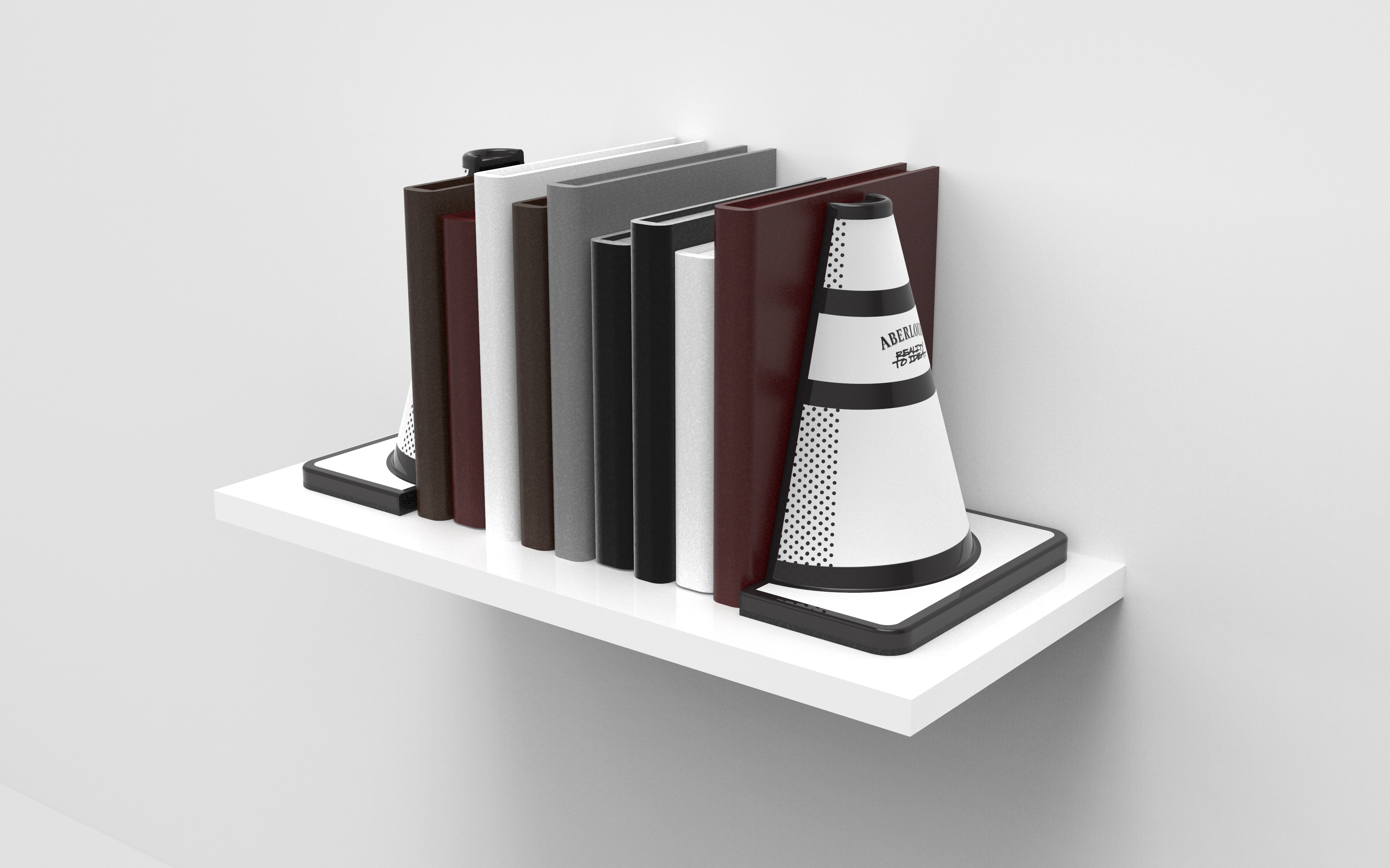
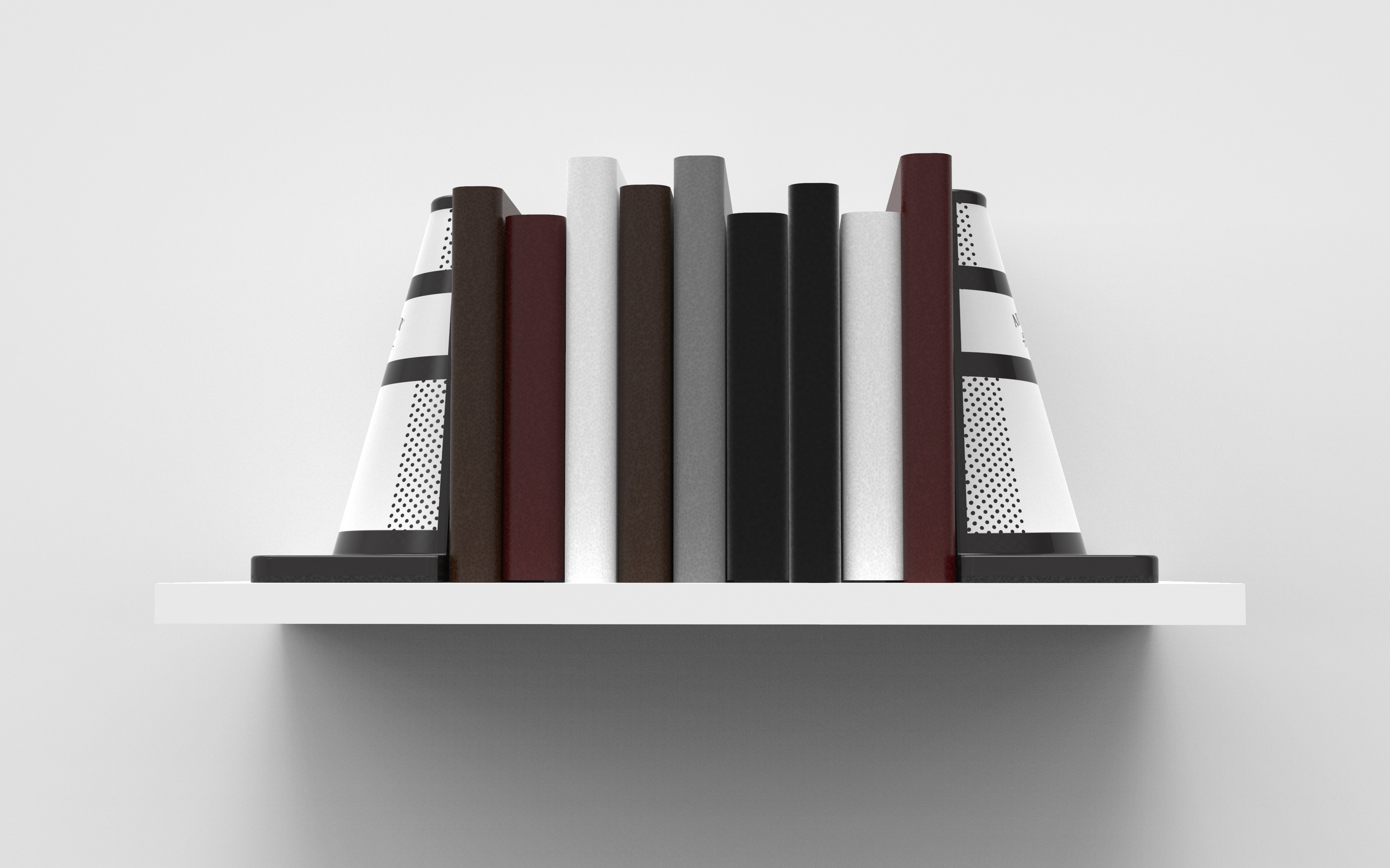
T H E B O O K E N D S
The two sides of the packaging are held together by a strong array of magnets, but when pulled apart the packaging can double as bookends. A grippy base and dense material ensure the packaging can take the weight of the books without moving.